

Mooseworks Entry Controls
Text Control
The Compact Framework Text Box and Label controls lack some properties that are available in the desktop versions. The Enhanced Text Box, Label, Numeric Text Box and Numeric Label controls add Borders, Autosizing, and Tag properties to the base CF controls.
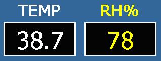
- Four border types - None, Fixed Single, Fixed 3D, and Underline (Text Boxes only)
- Numeric Text Box and Label add numeric formatting - precision and hex
- Properties for Border Color, Shadow Color for 3D, and Border Thickness
- Autosizing property
- Tag property to store user data
- 100% native .Net.
Radio Button/Group Controls
The Compact Framework Radio button is not particularly flexible. It doesn't size well, and doesn't allow use of images. We've fixed that, and created an easy to use Radio Button group.
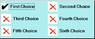
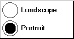
- Image Properties Defines pictures to be shown for the checked and unchecked states. If no images are provided, standard images will be drawn.
- Indication of Focus Radio buttons will indicate focus with a dotted line drawn around them.
- Toggle on Click Radio buttons will toggle when clicked in any area including the Text.
- Toggle on Space Radio button will toggle when the space key is pressed while the radio button has focus.
- Arrow Keys Arrow keys will move focus through the radio group without changing selection.
- Group Selected Index An integer that indicates which radio button is selected.
- 100% native .Net.
Check Box Control
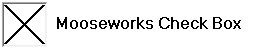


- Image Properties Defines pictures to be shown for the checked and unchecked states. If no images are provided, standard images will be drawn.
- Indication of Focus Check Box will indicate focus with a dotted line drawn around them.
- Toggle on Click Check Box will toggle when clicked in any area including the Text.
- Toggle on Space Check Box will toggle when the space key is pressed while the Check Box has focus.
- 100% native .Net.